Exploring a Paradox - Increasing Software Deployment Frequency improves Quality
15 Sep 2023Deploying frequently improves quality? Wait, shouldn’t we have good test coverage first?
Let’s explore the paradox.
The art of continuous delivery is full of counter intuitive ideas. These ideas don’t make sense when explained linearly, but do make sense when we look at through the systems dynamics lens.
One of these counter intuitive ideas is the relationship between deployment frequency and quality.
Narrating the Story with Causal Loops

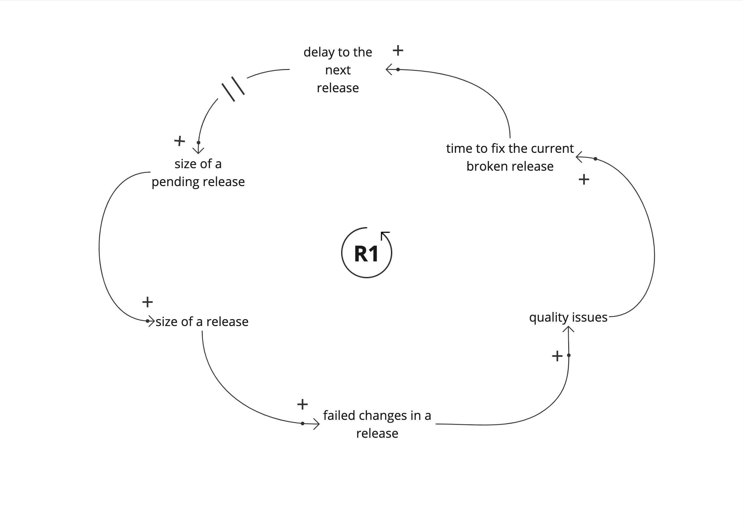
Lets look at the story here using a simple causal loop diagram. This is a common pattern I see in many teams. The contextual details vary between teams.
We start with a large set of changes. Until the set of changes is released to a user in production, we don’t know if it works. Each release is set of changes that could potentially break production.
These failed changes increase quality issues in production. It takes time to fix the issues and fixing them increases the delay to the next release. This delay increases the size of the next release, and increases the amount of potentially failed changes in the future release.
This is a reinforcing loop (R1). A vicious cycle. This leads to worsening product quality.
However, teams struggle through this vicious cycle, and the system doesn’t degrade drastically over time. There are limiting factors that are applied to stop this vicious cycle of worsening quality.
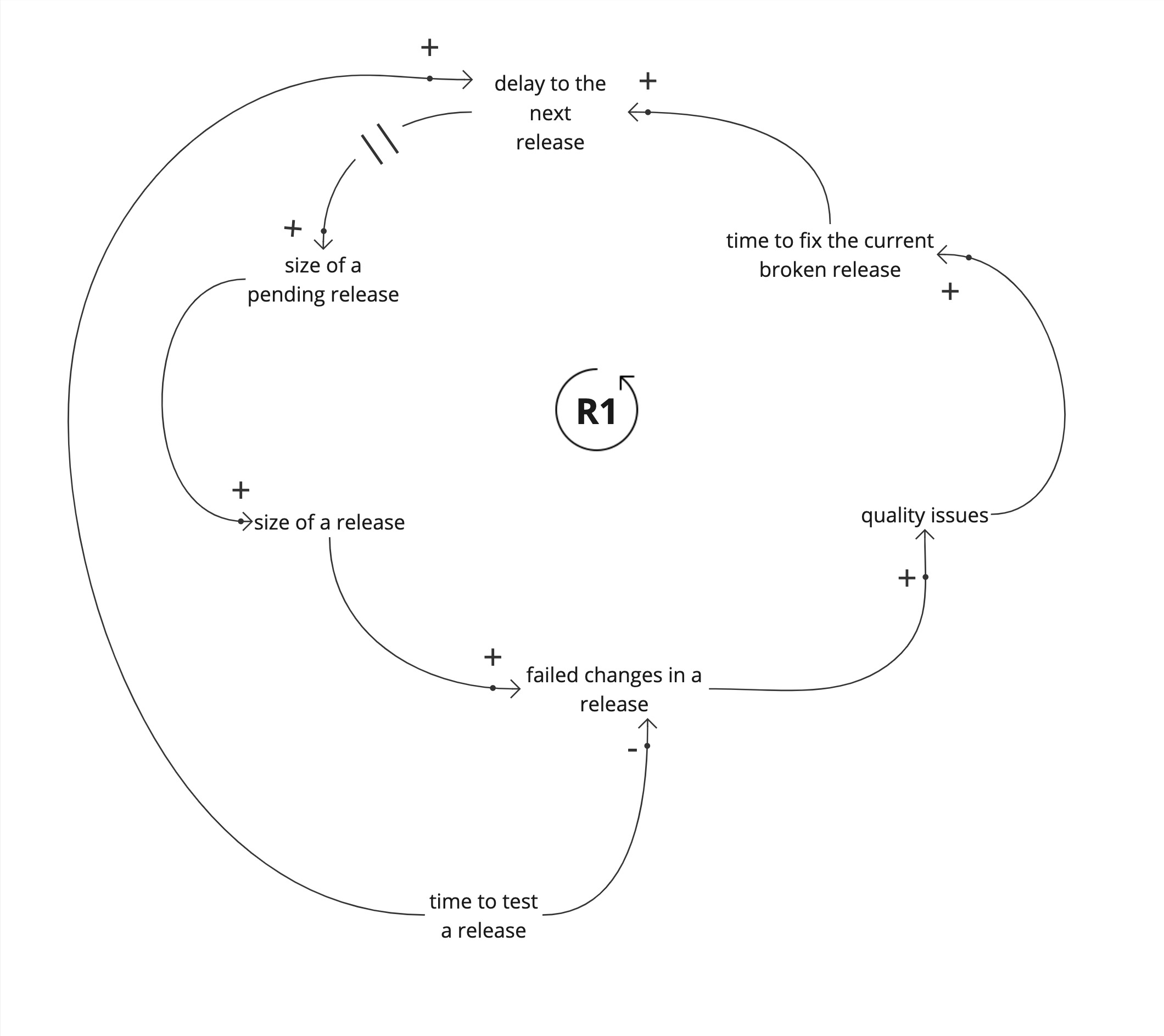
The most common limiting factor is increasing the time to test a release.

This looks like a sane strategy at first. The longer we take to test a pending release, the less likely it will break in production. But this increases the delay to the next release, adding to the amount of changes in the next release. By taking longer to test a release we are inadvertently worsening quality.
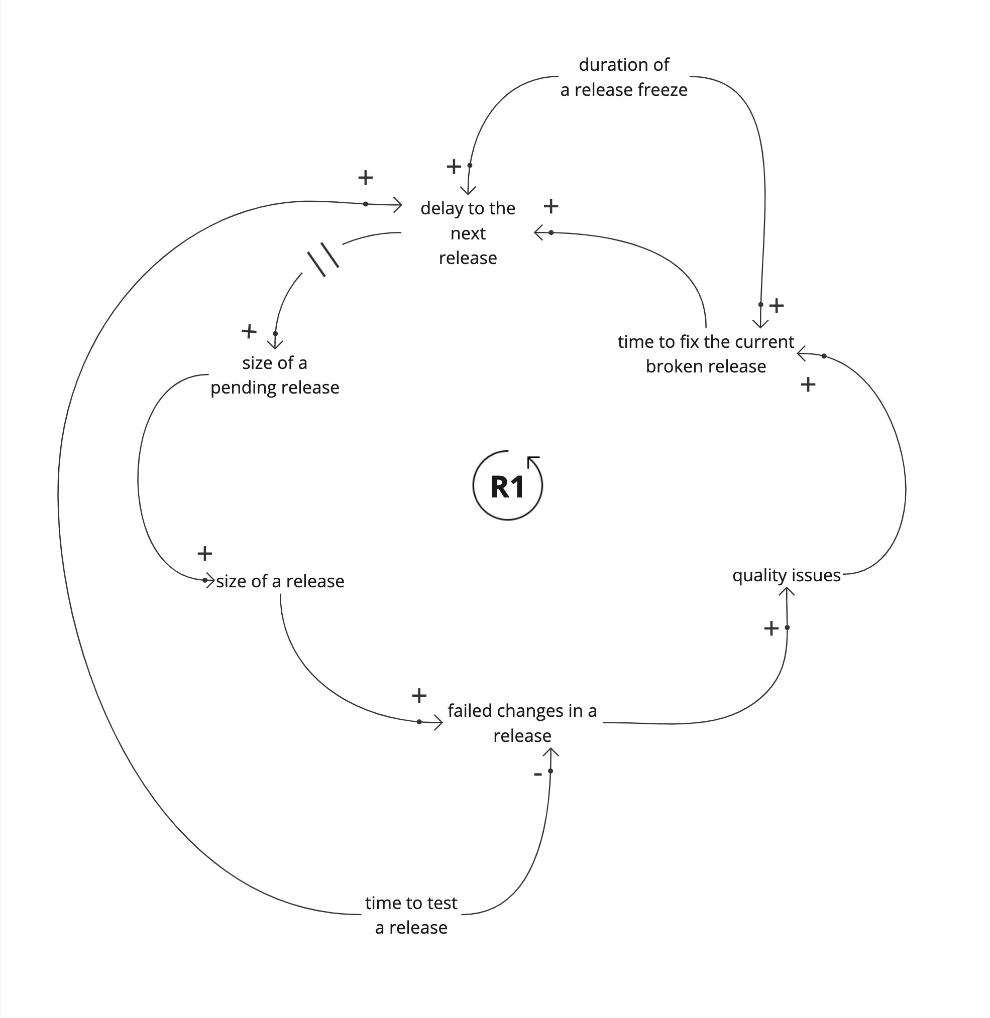
Lets look at another limiting factor, the release freeze. A release freeze buys us time to fix the current release.

Again, this increases the delay to the next release, and the changes pile up. Even if we temporarily fix the current release, release freezes reduce product quality.
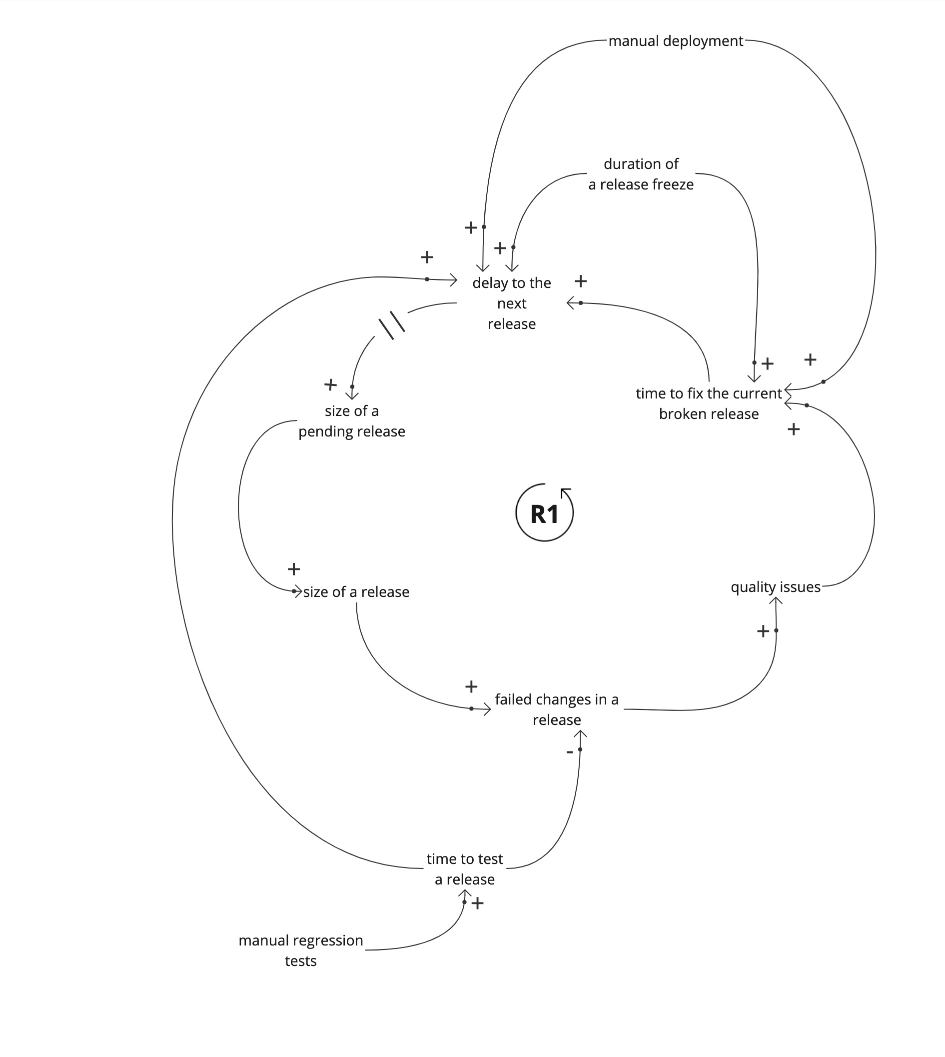
Lets look at other contributing factors adding to delays between releases.

Manual deployments and manual regression tests add to the delays between releases. This is sometimes obvious, but their relationship to the size of a pending change set is not always obvious.
Identifying leverage points
How do we get out of the vicious cycle? What leverage points to we have? In a vicious cycle, reducing any variable, reduces effect of that variable to the next.
Our leverage points are found by looking at what would contribute to reducing the effect of a variable in the vicious cycle.
Now that we have our casual loop model, we can look at what happens if we increase the deployment frequency.
Increasing the deployment frequency reduces the delay to the next release. We release what we have. But we can’t increase the deployment frequency because, if we can we would have done so.
There are variables that limit us from increasing the deployment frequency, such as the time taken to run manual regression testing steps, and the time taken to do manual deployments.
Reducing the delay, decreases the size of a release, reducing the probability of failed changes. Even if there are failed changes, the time to fix broken changes in a smaller release is less, in comparison with a larger release.
This in turn reduces the delay to the next release and improves quality. Now that we know the variable we need to change, and which variables contribute to it, we can look at interventions.
Manual deployments are a contributing factor to the delay between releases. Automating deployments reduces the amount of manual work, and contributes to reducing the delay between releases.
Manual regression tests are a contributing factor to the delay between releases. Automating regression tests, reduces the time taken to test a release, contributes to reducing the delay between releases.
Move fast to fix things
We can see how increasing deployment frequency improves quality using a causal loop diagram. Mapping our system allows us to see our system and the “engine” that drives worsening product quality (or what makes it better).
System Dynamics and Causal Loop diagrams allow us to explore counter intuitive concepts, that can’t be explained with a linear model. We can find the leverage points in our system that create lasting change, instead of temporary band-aids, like release freezes or increasing time for manual regression testing.